Posts

Fonts

Image
fonts Font - One particular weight or style of a larger type face Typeface - categories comprised of different fonts, (EG- Serif is a typeface, times new roman is a font part of serif.) Type Faces-  Serif - identifiable by small lines added to letters. Easy to read in print. fonts including Times new Roman, Georgia, and Book Antiqua. Sans Serif - dont have serifs, easy to read on websites. Fonts include, arial, Verdana and helvetica.  Script - mimics human hand writing, including comic sans, Kristen and lucida.  Modern - varies between thin and thick bold lettering, including rockwell, impact and agency. Monospaced - larger spacing between letters resembling and typewriter. includes, courier, consoles and Monaco. Analysing fonts-  Something you'd see on a country music magazines, thick bold lines could relate more to the modern type face, making the font appear more masculine, but the curls and hand written style makes it appear more femin

Editing Images

Image
Thumbnails and edits. For the two photos I made the foreground a lot darker than the background so that Noya stood out even more in her red coat against the green grass. I made the image cool toned as the main colour in the photo is blue from the sky so I made it more pronounced so the picture was more consistent despite the array of colours. For this one I cropped so it looked like a panoramic shot, which makes the lines of the seats stand out and reach the subjects more clearly. I also made the foreground darker, but more saturated. For this picture I made it high contrast and black and white. The focus is on her legs, but to make her body stand out more, I focused all the colour on to her jacket by isolating it with the magic wand, and then adding a red overlay layer on top. I brightened the photo up and made the blacks and white more prominent against the primarily green background. I then cropped it into a square image to frame the subject b

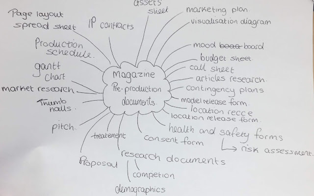
Magazine pre production mind map

Image

the conventions of magazines.

Image

Electronic music magazine proposal

Image
JUICED Magazine.   My goal is to create a magazine focused on the electronic genre and its artists, combining music with technology in both content and format. The magazine will have both a printed copy and a website to keep the magazine relevant to the constant change in consumerism and audience fragmentation the Internet has created. In order to keep a clear link between  the print and the website, there will be bar code scanners on the magazine which can be read by an app on the site, playing clips of up and coming electronic musicians and even older classics.  Electronic has been increasing in popularity due to the grow in technology and how professional the music can sound with electrical music equipment. It employs   electrical musical instruments  , digital instruments and  circuity-based music technology, and even artists that don't describe themselves as electronic implement these digital instruments into their songs, such as Dua Lipa and Anne Marie. Artists and

Magazine Cover Mock Up

Image
I made a mock up magazine cover focused on female artists for an teenage girl demographic of 13-18.

Competing magazines

Image
Time Out London Magazine - Distribution - Sold in Tube stations and can be read online, Tube allows for it to reach their audience of working Londoners. Also available in cafes, cinemas, bars, pubs, shops and hotels. International Style - white, Black and red, thick fonts. Pop art style. simplistic to stand out. sticks to basic colour scheme. One main image Genre - Gossip and celebrity magazines. Content - Has information on celebrity gossip and gigs, but also articles on what to do in the cities, major events and shows and movies. As well as classic click bait like stories such as "save $$$" and how to get a "cool" job. Q Magazine- Distribution - can be bought at news agencies, supermarket. Have a website, twitter and Instagram to keep people informed and is posted every month, £1 an issue. Style - Bold red white and black. Simplistic colour scheme, thick fonts. Changing fonts depending on the artist featured. One main image on cover. Genre