Editing Images
Thumbnails and edits.

For this one I cropped so it looked like a panoramic shot, which makes the lines of the seats stand out and reach the subjects more clearly. I also made the foreground darker, but more saturated.


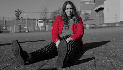
For this picture I made it high contrast and black and white. The focus is on her legs, but to make her body stand out more, I focused all the colour on to her jacket by isolating it with the magic wand, and then adding a red overlay layer on top.
I brightened the photo up and made the blacks and white more prominent against the primarily green background. I then cropped it into a square image to frame the subject better.


Comments
Post a Comment